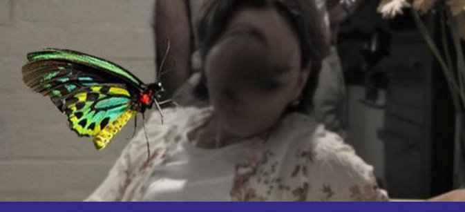
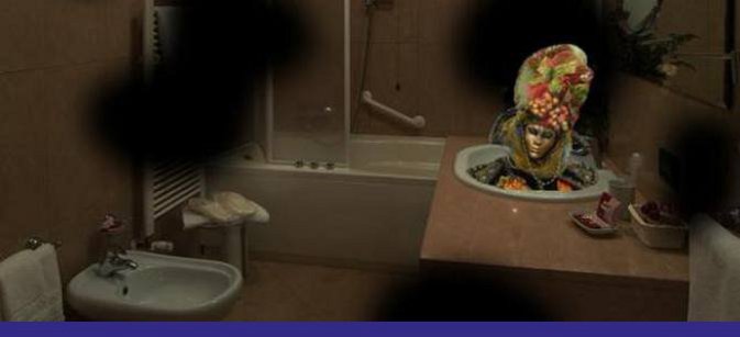
The Foundation’s logo is unusual to look at for the first time. True. It is meant to reflect the unusual nature of the CBS condition but also has embedded within it a few layers of meaning relevant to the syndrome.

The blurry dot in the centre
Often vision impairment organisations will use a central eye symbol to indicate that they work within the eye health care field. It was tempting to do so here also because CBS can occur from any form of eye disease.
However, it was felt that there were four advantages to depicting a blurred eye:
- People who experience CBS often feel that their eyes are ‘playing tricks on them’. The blurry eye reflects this aspect.
- Most people with CBS live with a vision impairment, which means some of their vision is incomplete or a blur.
- The CBS images are often experienced as having an unusual or bizarre nature. The central blurry spot captures this quirky aspect of the syndrome.
- The condition remains largely unknown even to medical practitioners. Silence and the unknown (ie. a blur) continues to surround CBS.
The different colours
A pronounced aspect for the person living with CBS is that the images are often reported as vivid and colourful. Some even report the images being hyper-colourful. This is often in stark contrast to their everyday experience of a faded or ‘washed-out’ world due to vision loss.
The actual design
The design comprises two components:
- A central blurry spot of an eye
- Two commonly experienced images of Charles Bonnet syndrome: flowers and geometric patterns.
The lighter/faded colours at the logo edges
This was purposely done to try and create a sense of depth to this two dimensional image. In doing so, it is trying to replicate life-like, 3D images that CBS-affected people 'see'.
 |
 |
 |
 |
|
Logo designed by Farida Tayeb


